Using Bivariate Poisson Regression to Calculate Park Effects, Home Field Advantage, and Team Effects
I recently read a paper written by Luke Benz and Michael Lopez that estimated the change in home field advantage in soccer leagues around the world due to not having fans in the stands in 2020. In their paper, the used a Bayesian Bivariate Poisson regression model that included the effect of team offense and defense and the effect of being the home team both before and during the pandemic to explain goal scoring. They compared the effect of being the home team before and after the pandemic to see if home field advantage got smaller in the various leagues.
Their project included a GitHub repository with all the scripts necessary to reproduce their research. Because of this, I decided to replicate their methods, but using Major League Baseball instead. Unfortunately, while they had several leagues to look into, I only had one, leading to less interesting results. Because of this, I decided to add to their model. Instead of measuring just two home field effects (one pre-2020 and one for 2020), I measured an effect for each season going back to 2010. Additionally, I included an effect for the ballpark (known as a Park Factor) on the run scoring environment. Thus, the sampling model for my project was
\[(Y_{H_i}, Y_{A_i})|\boldsymbol{\mu}, \boldsymbol{\alpha}, \boldsymbol{\delta}, \boldsymbol{\gamma}, \mathbf{T} \sim BP(\lambda_{1i}, \lambda_{2i}, 0),\] \[log(\lambda_{1i}) = \mu_s + \alpha_{H_is} + \delta_{A_is} + \gamma_{ps} + T_s,\] \[log(\lambda_{2i}) = \mu_s + \alpha_{A_is} + \delta_{H_is} + \gamma_{ps},\]
where \(Y_{H_i}\) is the runs scored by the home team in game \(i\), \(Y_{A_i}\) is the runs scored by the away team in game \(i\), \(\mu_s\) is the baseline runs scored for season \(s\), \(\alpha_{ts}\) is the offensive effect of team \(t\), \(\delta_{ts}\) is the defensive/pitching effect of team \(t\), \(\gamma_{ps}\) is the effect of playing in ballpark \(p\) in season \(s\), and \(T_s\) is the home field advantage effect for season \(s\). Because the model is on the log scale, all of the effects are multiplicative effects, which is useful for transforming the effect to the \(+\) scale, where 100 is league average and 101 is 1% higher than league average. Note that I am assuming that the covariance in the Bivariate Poisson regression model is 0, meaning the runs scored by the home team is independent of the runs scored by the away team.
The prior distributions for each parameter are below:
- \(\mu_s \sim Normal(2,5)\)
- \(\alpha_{ts} | \sigma_{off} \sim Normal(0, \sigma_{off})\)
- \(\delta_{ts} | \sigma_{def} \sim Normal(0, \sigma_{def})\)
- \(\gamma_{ps} | \sigma_{park} \sim Normal(0, \sigma_{park})\)
- \(T_s | \sigma_{home} \sim Normal(0,\sigma_{home})\)
- \(\sigma_{off} \sim InverseGamma(1,1)\)
- \(\sigma_{def} \sim InverseGamma(1,1)\)
- \(\sigma_{park} \sim InverseGamma(1,1)\)
- \(\sigma_{home} \sim InverseGamma(1,1)\)
The prior for the baseline runs scored is flexible enough to switch to the run scoring environment for each season. The effects of the batting team, pitching team, stadium, and home field advantage may shrink slightly towards 0.
The data I have come courtesy of Retrosheet. For each game from 2010 to 2020, I have the home team, the away team, the season, the stadium, the home runs scored, and the away runs scored, everything necessary to fit the model. Below is an example of 10 rows of the data set.
library(tidyverse)
source("dbcon.R")
games <- dbGetQuery(con, "select home_team, visiting_team,
                    year_id, park_id,
                    home_runs_score, visitor_runs_scored from retro_games
                    where cast(year_id as integer) >= 2010")

head(games, 10)
## home_team visiting_team year_id park_id home_runs_score visitor_runs_scored
## 1 OAK SEA 2019 OAK01 7 9
## 2 OAK SEA 2019 OAK01 4 5
## 3 CIN PIT 2019 CIN09 5 3
## 4 LAN ARI 2019 LOS03 12 5
## 5 MIA COL 2019 MIA02 3 6
## 6 MIL SLN 2019 MIL06 5 4
## 7 PHI ATL 2019 PHI13 10 4
## 8 SDN SFN 2019 SAN02 2 0
## 9 WAS NYN 2019 WAS11 0 2
## 10 KCA CHA 2019 KAN06 5 3To get a general idea of home field advantage, we can look at the winning percentage of the home team or average runs scored by home/away teams for each season. It appears home field advantage may have been smallest in 2019.
games %>%
  group_by(year_id) %>%
  summarize(home_win = mean(home_runs_score > visitor_runs_scored)) %>%
  ggplot(aes(x=year_id, y = home_win)) +
  geom_col() +
  geom_hline(yintercept = .5, col = "red") +
  theme_light() +
  ylim(0,1) +
  labs(x = "Season", y = "Home Team Winning Percentage")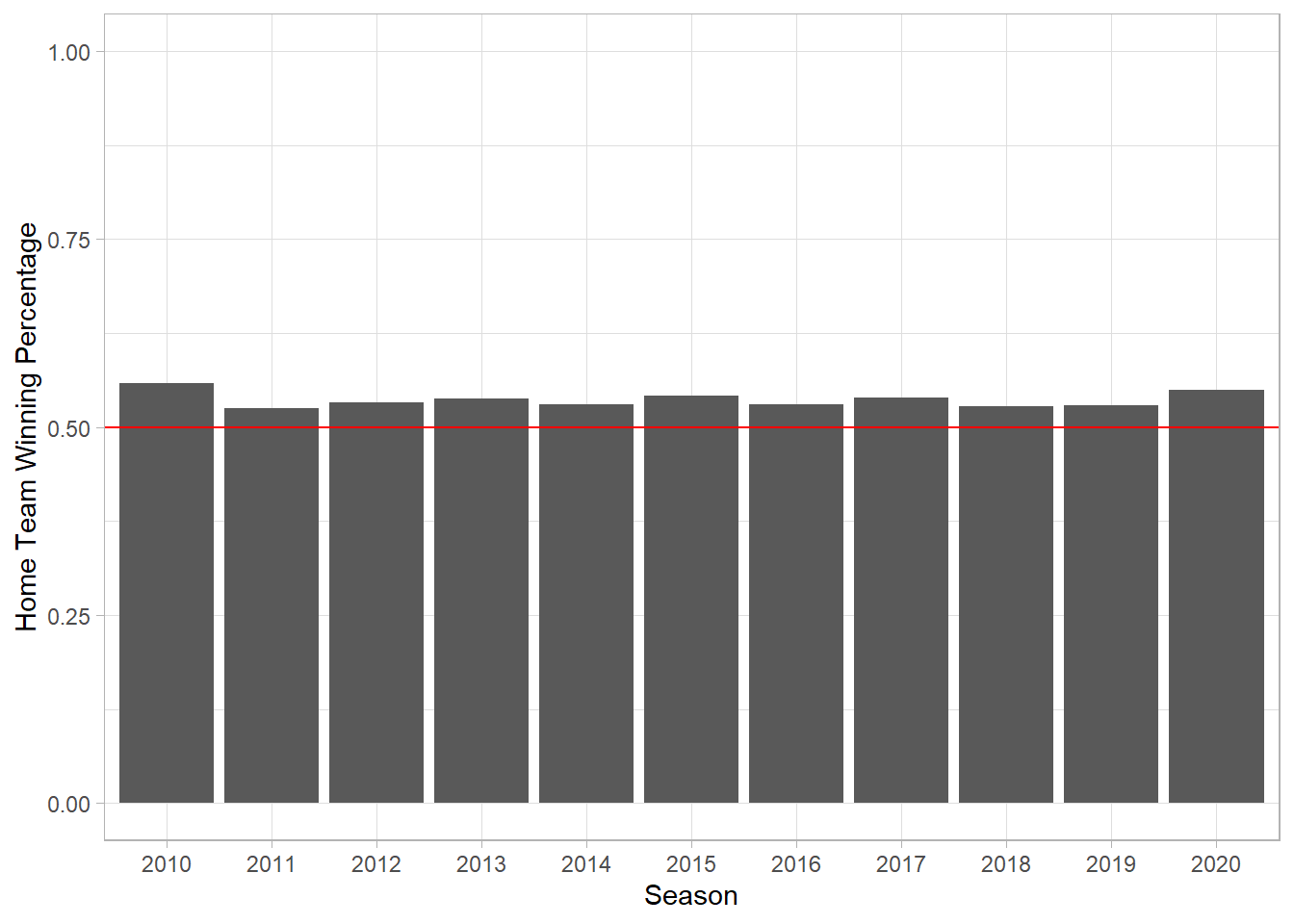
games %>%
  group_by(year_id) %>%
  summarize(Home = mean(home_runs_score),
            Away = mean(visitor_runs_scored)) %>%
  pivot_longer(-year_id) %>%
  ggplot(aes(x=year_id, y = value, col = name, group = name)) +
  geom_line() +
  theme_light() +
  labs(x = "Season", y = "Average Runs Scored", col = "Team")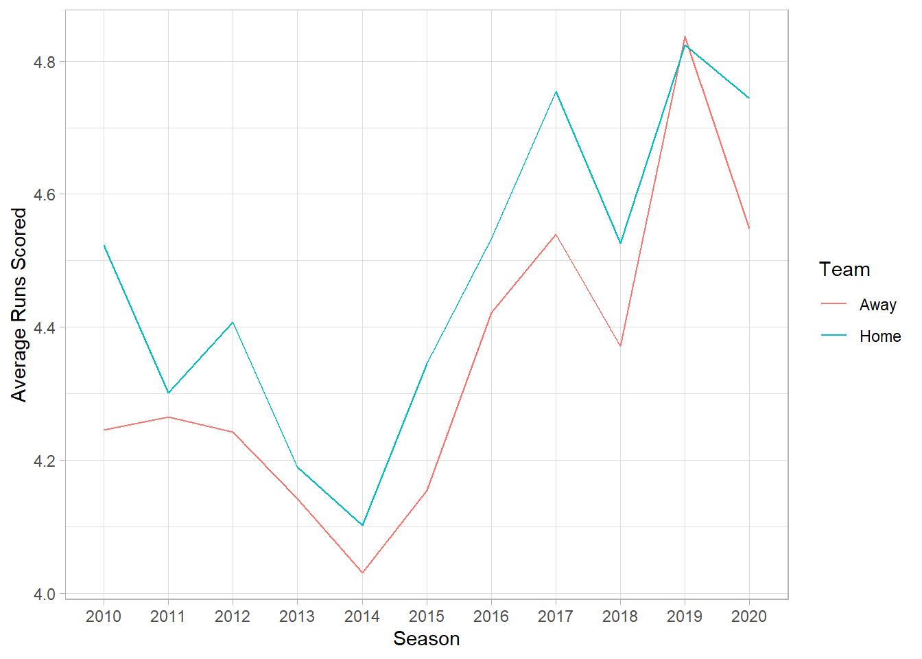
Borrowing and slightly adjusting some of the code from the Benz and Lopez paper, I will fit the model in Stan. Below shows the Stan code necessary to run the model and the R code that executes the Stan code in an R session.
data {
  int<lower=1> num_teams;                                     // number of teams
  int<lower=1> num_games;                                     // number of games in the data set
  int<lower=1> num_parks;                                     // number of stadiums
  int<lower=1> num_seasons;                                   // number of seasons

  int<lower=1,upper=num_seasons> season[num_games];           // season for game g
  int<lower=1,upper=num_teams> home_team_code[num_games];     // home team for game g
  int<lower=1,upper=num_teams> away_team_code[num_games];     // away team for game g
  int<lower=1,upper=num_parks> park_code[num_games];          // stadium for game g

  int<lower=0> home_score[num_games];                         // home runs for game g
  int<lower=0> away_score[num_games];                         // away runs for game g
}

parameters {
  vector[num_teams] alpha;                  // offense effects
  vector[num_teams] delta;                  // pitching/defense effects
  vector[num_parks] gamma;                  // park effects

  real<lower=0> sigma_a;                  // offense sd
  real<lower=0> sigma_d;                  // defense sd
  real<lower=0> sigma_home;               // home sd
  real<lower=0> sigma_park;               // park sd

  vector[num_seasons] mu;                   // log mean runs/game
  vector[num_seasons] home_field;           // home field advantage effect

}
model {
  vector[num_games] lambda1;
  vector[num_games] lambda2;

  // priors
  alpha ~ normal(0, sigma_a);
  delta ~ normal(0, sigma_d);
  gamma ~ normal(0, sigma_park);
  home_field ~ normal(0, sigma_home);
  mu ~ normal(2, 5);
  sigma_a ~ inv_gamma(1,1);
  sigma_d ~ inv_gamma(1,1);
  sigma_park ~ inv_gamma(1,1);
  sigma_home ~ inv_gamma(1,1);


  // likelihood
  for (g in 1:num_games) {
    lambda1[g] = exp(mu[season[g]] + home_field[season[g]] + alpha[home_team_code[g]] + delta[away_team_code[g]] + gamma[park_code[g]]);
    lambda2[g] = exp(mu[season[g]] + alpha[away_team_code[g]] + delta[home_team_code[g]] + gamma[park_code[g]]);
  }
  home_score ~ poisson(lambda1);
  away_score ~ poisson(lambda2);
}
num_games <- nrow(games)
num_seasons <- length(unique(games$year_id))
season <- as.numeric(factor(games$year_id))
home_team_code <- as.numeric(as.factor(paste(games$home_team, games$year_id)))
away_team_code <- as.numeric(as.factor(paste(games$visiting_team, games$year_id)))
park_code <- as.numeric(as.factor(paste(games$park_id, games$year_id)))
home_score <- games$home_runs_score
away_score <- games$visitor_runs_scored
num_teams <- max(home_team_code)
num_parks <- max(park_code)
stan_data <- list(
num_teams = num_teams,
num_games = num_games,
num_parks = num_parks,
num_seasons = num_seasons,
season = season,
home_team_code = home_team_code,
away_team_code = away_team_code,
park_code = park_code,
home_score = home_score,
away_score = away_score
)nCores <- 3
options(mc.cores = nCores)
rstan::rstan_options(auto_write = TRUE)
model <- stan(file = 'home_field_bivariate_2.stan',
data = stan_data,
seed = 73097,
chains = nCores,
iter = 5000,
warmup = 1000)library(rstan)
mu <- rstan::extract(model)$mu
alpha <- rstan::extract(model)$alpha
delta <- rstan::extract(model)$delta
gamma <- rstan::extract(model)$gamma
teams <- unname(as.character(levels(as.factor(paste(games$visiting_team, games$year_id)))))
colnames(alpha) <- teams
colnames(delta) <- teams
stadiums <- levels(as.factor(paste(games$park_id, games$year_id)))
colnames(gamma) <- stadiums
hf <- rstan::extract(model)$home_field
colnames(hf) <- paste("year", 2010:2020)
hf_df <- reshape2::melt(hf)
colnames(hf_df) <- c("iteration", "season", "effect")There are a variety of insights that can be gained from this model. First, for each season, we have an effect on runs scored for each team’s offense and defense/pitching. By raising \(e\) to the Bayesian Estimator under Squared Error Loss for each effect and multiplying by 100, we can convert each team’s offense and defense/pitching to the “+” scale, where 100 is league average and everything greater than 100 is above average. Below is a plot that shows each team’s Batting+ and Pitching+ for the 2020 season. The logos are courtesy of the teamcolors package.
library(teamcolors)
team_names <- read.csv("CurrentNames.csv", header = FALSE)

colnames(team_names) <- c("Franchise", "Abbr", "League", "Symbol", "Location",
                          "Name", "Other", "From", "To", "City", "State")

team_logos <- team_names %>%
  filter(To == "") %>%
  mutate(name1 = paste(Location, Name)) %>%
  select(Abbr, name = name1) %>%
  left_join(teamcolors, by = "name")


data.frame(team = teams, offense = unname(colMeans(alpha)), defense = unname(colMeans(delta))) %>%
  mutate(season = as.numeric(word(team,2)),
         team = word(team,1)) %>%
  group_by(season) %>%
  mutate(offense = exp(offense-mean(offense))*100,
         defense = exp(mean(defense)-defense)*100) %>%
  ungroup() %>%
  filter(season==2020) %>%
  left_join(team_logos, by = c("team"="Abbr")) %>%
  ggplot(aes(x=offense, y = defense)) +
  ggimage::geom_image(aes(image = logo), size = 0.08, by = "width",
                      asp = 1.618) +
  geom_vline(xintercept = 100, lty = 2, alpha = 0.8, col = 'seagreen') +
  geom_hline(yintercept = 100, lty = 2, alpha = 0.8, col = 'seagreen') +
  labs(x= "Batting+", y = "Pitching+", title = "Team Batting and Pitching: 2020") +
  theme_bw() +
  theme(strip.background =element_rect(fill="white", colour = "black"))+
  theme(strip.text = element_text(colour = 'black', size = 15))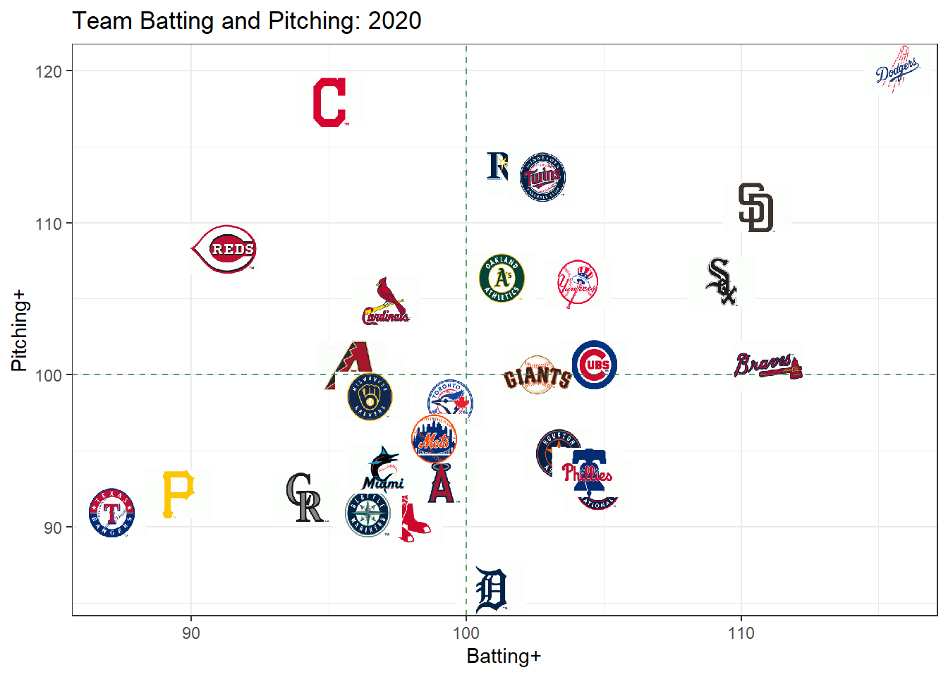
The Dodgers had the best lineup and pitching staff in the league, while the Rays, Twins, A’s, Yankees, White Sox, and Padres all had both an above average lineup and pitching staff. Cleveland, Cincinnati, and St. Louis had solid pitching but a poor lineup. The Rangers and Pirates appear to have been the two worst teams in the league.
There is also quite a bit of correlation between a team’s offense and pitching. If a team is good at batting, they are also likely to be good at pitching. The correlation between the batting and pitching effects for a season could be seen as a measure of parity (or lack thereof). If these is high correlation, the best batting teams are also the best pitching teams, so they will be much better than the rest of the league. The below plot shows the posterior distribution for the correlation between offensive and pitching effects for each season (from a random sample of 500 simulations).
get_off_def_cor <- function(rownum){
  data.frame(team = teams, offense = exp(unname(alpha[rownum,])), defense = exp(-1*unname(delta[rownum,]))) %>%
    mutate(season = word(team,2),
           team = word(team,1)) %>%
    group_by(season) %>%
    summarize(cor = cor(offense,defense), .groups = "drop")
}

set.seed(101)
off_def_cors <- map_df(sample(1:nrow(alpha), 500), ~get_off_def_cor(.x))
off_def_cors %>%
  mutate(season = as.numeric(season)) %>%
  group_by(season) %>%
  mutate(m = mean(cor)) %>%
  ungroup() %>%
  ggplot(aes(x=cor, y = season, group = season, fill = m)) +
  ggridges::geom_density_ridges(alpha = .8, quantiles = 0.5, quantile_lines = TRUE) +
  scale_y_continuous(trans = "reverse", breaks = 2010:2020) +
  scale_fill_gradient2(low="navy", high = "red", limits = c(-1,1)) +
  theme_light() +
  theme(legend.position = "none", panel.grid.minor.y = element_blank()) +
  labs(x = "Correlation Between Batting and Pitching Effects",
       y = "Season")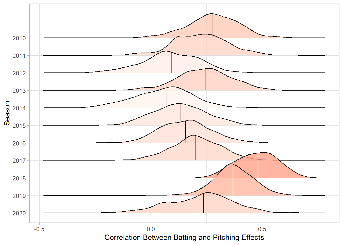
The 2018 and 2019 seasons have the highest correlation, which supports the notion that MLB was filled with super teams and tanking teams for those two years.
Because we have team effects for each season going back to 2010, we can plot each team’s development from 2010 to 2020. Below, we show the progression for the Red Sox, Cubs, Astros, Royals, Dodgers, Yankees, Giants, Rays, and Nationals.
data.frame(team = teams, offense = unname(colMeans(alpha)), defense = unname(colMeans(delta))) %>%
  mutate(season = as.numeric(word(team,2)),
         team = word(team,1)) %>%
  group_by(season) %>%
  mutate(offense = exp(offense-mean(offense))*100,
         defense = exp(mean(defense)-defense)*100) %>%
  ungroup() %>%
  filter(team %in% c("LAN", "BOS", "SFN", "NYA", "HOU", "CHN",
                     "TBA", "WAS", "KCA")) %>%
  #filter(season >= 2016) %>%
  left_join(team_logos, by = c("team"="Abbr")) %>%
  ggplot(aes(x=offense, y = defense, group = team, label = season)) +
  geom_path(aes(col = primary), size = 2) +
  ggrepel::geom_label_repel( alpha = .7, size = 3) +
  geom_vline(xintercept = 100, lty = 2, alpha = 0.8, col = 'seagreen') +
  geom_hline(yintercept = 100, lty = 2, alpha = 0.8, col = 'seagreen') +
  facet_wrap(~team) +
  labs(x= "Batting+", y = "Pitching+", title = "Team Progression: 2010-2020") +
  scale_color_identity()+
  theme_light() +
  theme(strip.background =element_rect(fill="white", colour = "black"))+
  theme(strip.text = element_text(colour = 'black', size = 15))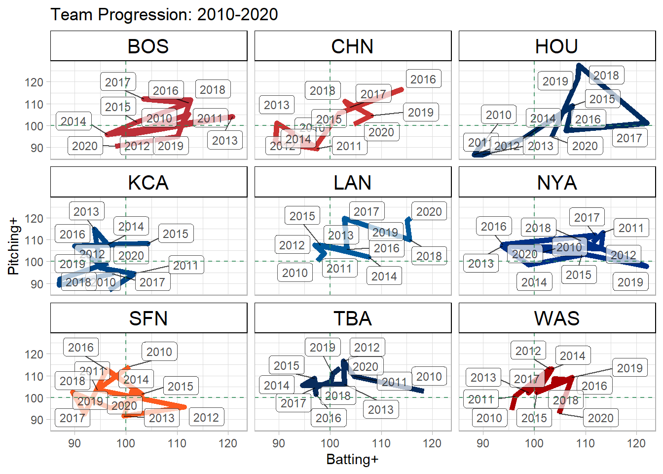
Some of the teams (Red Sox, Yankees) were extremely volatile throughout this period, while others, such as the Dodgers, Cubs, and Astros had a much clearer progression (and regression in the case of the Astros and Cubs).
Additionally, for each stadium, we have a park factor for each season, which can similarly be converted to the “+” scale. Highlighted on the plot below are some of the more extreme parks, Coors Field, Fenway Park, Rangers Ballpark in Arlington, PETCO Park, and Safeco Field/T-Mobile Park.
library(gghighlight)
data.frame(stadium = stadiums, effect = colMeans(gamma)) %>%
  mutate(season = as.numeric(word(stadium,2)),
         stadium = word(stadium,1)) %>%
  group_by(season) %>%
  mutate(effect = exp(effect-mean(effect))*100) %>%
  ungroup() %>%
  ggplot(aes(x=season, y = effect, col = stadium)) +
  geom_line(size = 2) +
  gghighlight(stadium %in% c("DEN02", "ARL02", "BOS07",
                             "SAN02", "SEA03"),
              unhighlighted_params = list(size = .8)) +
  geom_hline(yintercept = 100, col = "red") +
  scale_x_continuous(breaks = 2010:2020) +
  theme_light() +
  labs(x = "Season", y = "Park+", title = "Park Factors by Season") +
  theme(panel.grid.minor.x = element_blank())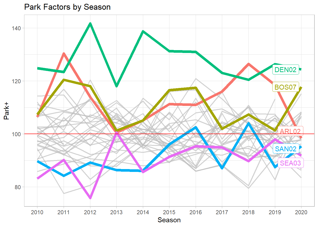
Finally, we can measure the effect of home field advantage by season. The below plot shows the posterior distribution of the effect of being the home team on your offense for each season. 2010 appears to have had the highest home field advantage, while 2011 and 2019 had the lowest. Additionally, the lack of fans in 2020 didn’t seem to decrease home field advantage at all.
library(ggridges)
hf_df %>%
  mutate(effect = exp(effect)*100) %>%
  mutate(season = as.numeric(word(season, 2))) %>%
  group_by(season) %>%
  mutate(mean_eff = mean(effect)) %>%
  ungroup() %>%
  ggplot(aes(x=effect, group = season, y = season, fill = mean_eff)) +
  geom_density_ridges(alpha = .5,
                      quantiles = 0.5, quantile_lines = TRUE,
                      scale = 1.2) +
  scale_y_continuous(trans="reverse", breaks = 2010:2020) +
  geom_vline(xintercept = 100) +
  theme_light() +
  scale_fill_gradient(low="lightblue", high = "navy") +
  theme(panel.grid.minor.y = element_blank(), legend.position = "none") +
  labs(x = "Home+", y = "Season", title = "Home Field Advantage by Season")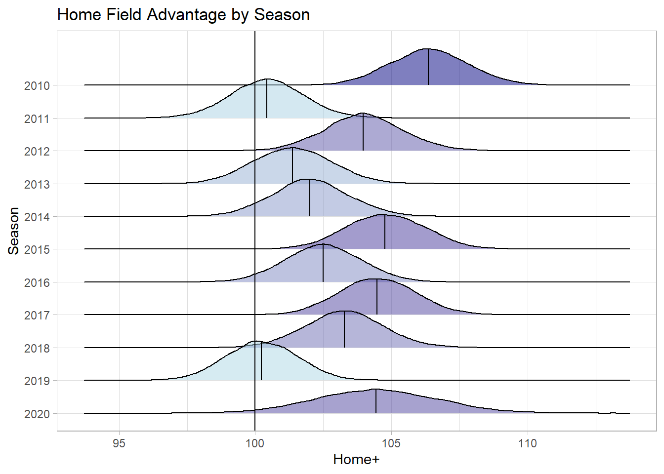
Thus, a wide variety of insights can be taken from this somewhat simple model. One future application could be to fit a similar model at a player level to attempt to measure a player’s value when in the lineup or pitching.